What is the Problem?
What is the Problem?
As we mentioned in the previous chapter, a good problem definition is a foundation for good campaign planning. It usually starts with assessment and data. Your campaign or project should have a solid foundation based on data and facts. That’s what adds credibility to your effort, as opposed to just your opinions about some cause. In general you may need to:
1. Collect Data
2. Make those data understandable and attractive to everyone
Collecting Data
2 . Make some basic surveys using free online applications
3. Collect individual testimonies (interviews with members of target groups – focus groups)
Both of the following apps will help you to easily DESIGN a questionnaire with various types of questions, DISTRIBUTE it easily via email, web or social networks and ANALYSE responses in the form of graphs and pie charts,…
Google Forms
Survey Monkey
Visualizing Data
Nobody likes spreadsheets and numbers, instead we like pretty images that are easy to understand. This is where the data visualisation comes in. We all know basic pie charts and graphs, but there are also other appealing ways to present data. You can use info graphics, maps and interactive online platforms. Here are some examples and resources that will help you in this process.
Tools for Data Visualizations
This list of available online tools will help you not just visualise data, but will also show you which tools are suitable for what purposes.
Other examples and ideas are also available at newtactics.org page.
“Drawing by numbers” project collects other great tips, tools and examples.
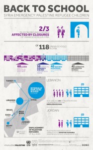
Example – Vizualizing Palestine
Look at how award winning project Visualizing Palestine brings important data to life through attractive infographics.
Example – Map Kibera
This project demonstrates how mapping and technology can empower local communities in making their lives visible.

